
Via Kevin Drum, here’s a doozy of a chart developed by blogger Afferent Input, comparing how the top income earners are faring, compared with everyone else.
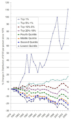 The left axis on the chart represents how the distribution of income has changed, from 1979 to the present. The various lines break down the trends by income group.
The clear messages: the top 1 percent are doing great; the next 1-4 percent are doing pretty well; but the bottom 90%—the bottom 5 lines on the chart—are getting squeezed out.
To me, these numbers put the lie to the adage that “a rising tide lifts all boats.” Really, it’s lifting yachts. And the rest of us are foundering at best, sinking at worst.
Mind you, this isn’t the end of the story: the chart shows relative income distribution, not absolute income. Adjusted for inflation, median income (best represented by the orange-ish line in the middle) has risen a bit nationally since the late 1980s, and remained roughly flat in the US Northwest. So compared with their parents, young entrants into today’s middle class aren’t so bad off—at least, not according to these numbers.
It’s just that the phenomenal growth of the economy over the last several decades—and the extraordinary wealth generated by the stock and real estate markets—hasn’t done all that much for the folks in the middle and bottom of the income ladder. Fair? Not so much.


ckthompso
There is a new post up on Afferent Input that shows change in just income levels, instead of change in share of income. The differences are even more striking. For instance, after-tax income has increase 228% in inflation adjusted dollars since 1979 for the Top 1%. The bottom 20% has seen an increase of only 6.25% since 1979. Rising tide indeed.
bsmith
Great information but only part of the story. Jacob Hacker, a political science Professor at Yale, has written a book called “The Great Risk Shift” where he documents the movement of financial risk from corporations and govenrnment to individuals and families over the past 25 years. You can read his testimony to Congress on the issue here.