
From a Willamette Live article, this chart virtually speaks for itself:
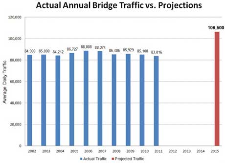
According to the article, the blue bars represent the combined traffic on two different bridges crossing the Willamette River in Salem, OR. The data show that traffic across the river has essentially flatlined for the last decade; there’s simply no evidence of growth. If anything, the numbers show a very slight decline, given that traffic reached a ten-year low in 2011.
Yet as recently as 2006, the state projected that traffic volumes would grow by 20 percent by 2015—as represented by the red line.
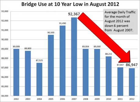
As the following chart shows, August 2012 saw further declines in traffic on the two spans.

In short, the official forecasts of traffic growth have proved preposterous. Perhaps they were made in good faith. But events have shown that the models that produced the projections are useless. No, strike that: they’re so deceptive, and leading to such poor decisions, that at this point they’re worse than useless.
Yet as has been so common throughout Cascadia—and beyond—transportation agencies have used these inflated traffic projections to justify big, expensive infrastructure projects. In this case, it’s a new bridge span across the Willamette and elevated highway. But the same pattern’s been seen all over: with the Columbia River Crossing in metropolitan Portland; the Gateway program in Vancouver, BC; the North Spokane Freeway; and, of course, all of the Seattle-area megaprojects underway or on the books. We’ve seen the same so many times now that I’m starting to wonder: how is it that the public, and their elected representatives, let this expensive, anti-environmental nonsense pass without a ruckus?


jonesey
You are right on. The Salem Breakfast on Bikes blog has been writing about this for years.
Start reading here:
http://breakfastonbikes.blogspot.com/search/label/Rivercrossing%20-%20Third%20Bridge
Clark Williams-Derry
Wow. Thanks for the link, Jonesy! It’s good to know that there are others out there who find all of this as ridiculous as I do.
John Gear
See LoveSalem.blogspot.com for more, and links to the petition against this Bridgasaurus Boondogglus, a fossilized relic of 1950s auto sprawl “thinking.”
The sprawl lobby has formed the usual AstroTurf group to promote this monstrosity which, surprise! Is slated to stomp all over poor and minority neighborhoods in order to spur development in the far reaches of Salem and out into Polk County because, you know, Freedom!
This project is almost beyond satire its so ludicrous. Salem faces another $30 million shortfall in schools, after having laid off hundreds of teachers and EVERY librarian in middle and elementary schools. We have NO bus service on weekends. At all. The public library is down to 16 hours a week in West Salem. The city hall complex is completely inadequate for seismic codes … And the police are housed in the bottom of it, underneath several floors of concrete. There are only a few schools that have any seismic resistance. And yet, according to the sprawl lobby, this Bridgasaurus is Absolutely Vital to Salem because things are going to turn around any day now, when gas goes back to a buck a gallon like God intended, and housing starts go back to the bubble era rates.
Clark Williams-Derry
Sigh. So typical.
Kelly Clowers
Might be nice to get an adjusted second graph, with the full bars, instead of cut off ones.
Clark Williams-Derry
Agreed. I’ll consider doing it. (I don’t really love that chart, by the way. I think it overemphasizes the downward trend, which, in the context of the numbers overall, looks closer to flat than falling off the cliff.)
Breakfast on Bikes
Thanks to Jonesey for the shout-out!
Clark, here’s <a href="http://breakfastonbikes.blogspot.com/2012/03/is-auto-highway-traffic-really-on-rise.html"<a discussion with a different graph that shows the same data perhaps in a form closer to your preference?
Breakfast on Bikes
Shoot!, try this.
Clark Williams-Derry
BonB – nice! Thanks!!
Jesse
I have to agree with Kelly as well. “No, strike that: they’re so deceptive, and leading to such poor decisions, that at this point they’re worse than useless” could apply to that second graph. Otherwise you’re perpetuating “the war on cars.”
I love the “Dude, Where’s My Cars” articles, as they plainly show the constant linear increase projection regardless of recent trends.
Apparently WSDOT traffic projections are easy. Display the the previous years’ traffic, then draw a line straight up and right.
John Gear
There’s an argument that the presentation is deceptive, sure, and if I were teaching statistics I’d point out the issue. On the other hand,the graph is defensible as shown because it focuses on precisely what the sprawl lobby has chosen to emphasize as the critical issue, the supposedly increasing number of trips that supposedly requires a gigantic new Bridgasaurus to serve.
The graph accurately portrays the data, and avoids inviting the viewer to demphasize the salience of the inflection point, which is a huge issue. This isn’t about two projections of growth. This is about reality (trips going DOWN) vs. sales pitch (hand waving by the sprawl lobby to suggest that trips demand is going up).
Clark Williams-Derry
Fair enough!
I worry that the chart emphasizes the idea that “traffic is going down.” But if traffic ticks up next year — say, because the economy picks up a bit, or gas prices stay closer to $3 than $4 per gallon — bridgeasaurs can say “see, you’re wrong, traffic really is growing again!!” That’s the only real reason I like framing the trend as “traffic is basically flat, or perhaps declining a bit.” With that frame, it’s easier to portray the next little uptick (if it comes) as just part of the “bumpy plateau” we’ve been experiencing for a decade, rather than a turnaround or inflection point in driving.
But this is all a quibble. I think we’re in complete agreement on the core issues: traffic is flat or declining; traffic models that predict rapid growth have been dead wrong for over a decade now; and Big Highway is misusing the results of these flawed models to argue for big highway projects that the region doesn’t need and can’t afford.
John Gear
You know, I had an inspiration this evening. I’m going to find the population stats for every year on that graph and convert the graph to a plot of something like daily crossings per 100,000 residents in the Salem MSA, which i bet you will have same general shape but even more exaggerated. Then I’m going to start arguing that, based on trends from their own data, the hordes of people coming means that there soon will be no congestion at all, since absolute daily crossings decline as population rises. Sure, it’s bogus in a way, but at least it’s true to the data, unlike anything the sprawl lobby says.
We all freely admit that there is a “Rush” period, about a half hour a day in the afternoons, m-f, under the current arrangement, where the overwhelmingly largest employer, the state, operates on a pre-1980s factory model, where all the workers … (Most of whom are white collar cubedwellers, who are screen readers, phone talkers, and meetings goers, many of whom could do just as much work from home as the office, were it not for the middle managerial need to justify middle management) are forced to act as if they all worked on an assembly line.
If the state pulled its head out, stopped generously subsidizing parking, and started evaluating managers positivelt for approving flextime schedules and telework, there’d be no rush minute in Salem at all.
Ruben
I think Charles Marohn’s Strong Towns blog is simply the best I have ever seen on this, and many other topics concerning municipal finances, engineering, growth–the whole development racket. The post I have linked below sums up all his posts on the Projections Fallacy.
The Projections Fallacy – Strong Towns Blog – Strong Towns
Clark Williams-Derry
Great find, Ruben. I love Strong Towns!!
Brenton Clark
Why don’t the numbers on the two different charts match? They look like they’re supposed to be measuring basically the same thing – average daily bridge traffic.
Clark Williams-Derry
I think the first chart shows average traffic for the entire year, and the second only shows traffic in August. (Summertime traffic is generally higher than the all-year averages.)
Bill Frisinger
Your graph titled “Bridge Use at 10 year low” exhibits one of the classic examples of how to lie with statistics.
By making a graph that cuts off the bottom portion you make the change look much more radical than it actually is.
Your first graph does a much better job of showing what the trends are.
It is also worth pointing out that both graphs show that if economic growth returns to pre recession levels (and we all hope it will) than we can expect continued increase in traffic. The projected number at 2015 still looks a little high but not off the wall.
Clark Williams-Derry
I can’t claim credit for either graph. I just got them from the source I linked to. But as I mention above in comments, I generally agree: that second graph isn’t really to my taste.
I disagree with your last paragraph, since I see the numbers as suggesting that traffic is flat, despite population & economic growth since 2009. The wild card may be gas prices, though.