

Someone recently, earnestly, told me that Oregon and Washington legislative lines must be gerrymandered “because Democrats win more elections, but both states are actually red.” When I asked what they meant by that, they said, “Just look at the maps!”
 Loren Culp, who ran for governor against incumbent Jay Inslee in Washington in 2020, used the same logic when he showed maps of counties in Washington as proof that the election results were wrong.
Maps can be powerful and important visuals for helping people quickly understand complex geography-based information—hence their prevalence in election-night newscasts. But they can also distort viewers’ understanding of election outcomes, because first and foremost, they show acres, not the number of people living on those acres. And in an election? It’s the people that should matter.
The numbers are clear: in 2020, 57.97 percent of Washington voters chose Joe Biden, and only 38.77 percent chose Donald Trump. Similarly, one state south, 56.45 percent of Oregon voters chose Joe Biden in 2020 compared to just 40.37 percent for Donald Trump.
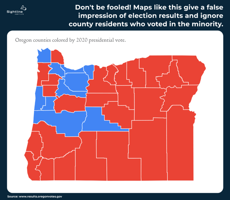
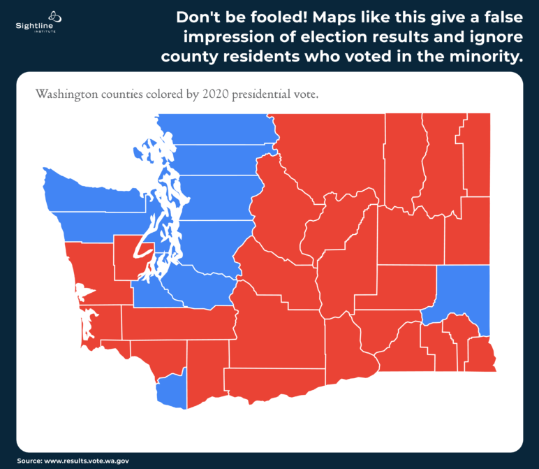
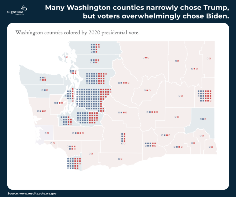
But maps that color entire counties red or blue can dupe viewers: they make both states look majority red. And they make counties look like monoliths in a way that is unhelpful to Americans interested in bridging current political divides. If you didn’t understand how voting works, you would think the maps above show that Trump won handily in the Pacific Northwest. You might also think there are no conservatives in urban areas and almost no progressives in the rural region east of the Cascades.
It seems that the state winner-take-all electoral college process for choosing the US president has infected the way we think about voters within a state, too. When electing the president, we do this weird thing where we don’t count up all the people’s votes; we count each state’s electoral votes. The visuals we then see out of this count are maps where each state is solidly blue or solidly red, painting over the reality that there are plenty of voters of both and other persuasions throughout all states. Such maps also distort the reality that some states have a lot of people, while other states have a lot of land. The maps show the land, not the people, thus tricking our minds into thinking that acres vote. (Thankfully, some outlets are starting to use more accurate maps, like these.)
In every other US election—state governors, city mayors, Congressional and state legislature representatives—we do the sensible thing and count up all the people’s votes to determine those races’ winners. Yet some have taken the distorted visuals from the electoral college and applied them at the county level, where it makes no sense at all because counties have no role in determining presidential or state-level elections.
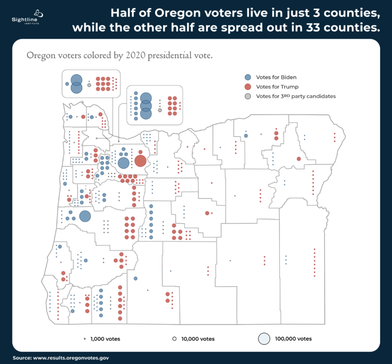
Oregon has one very concentrated metropolitan area and large swaths of less populated land. Displaying county lands, rather than Oregon voters, creates a disingenuous visual. In the maps above, counties are colored red or blue based on which presidential candidate won more votes there in 2020. But this view fails to represent how many voters are in each county, which is what really matters in a democracy.
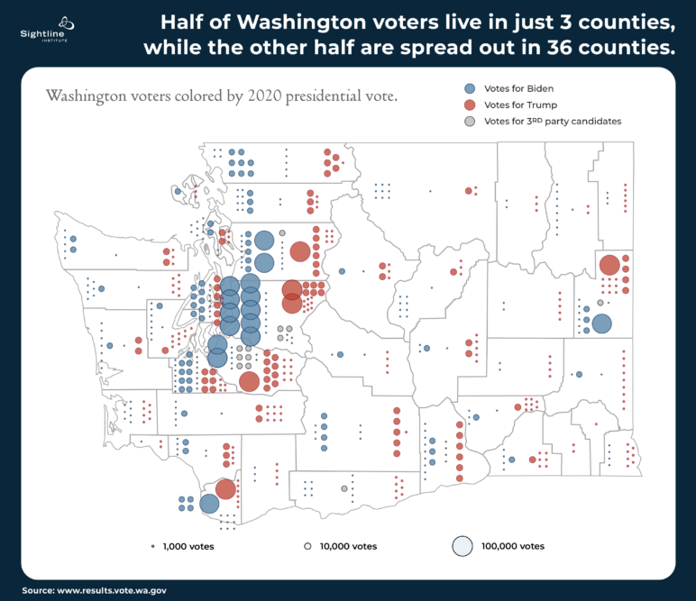
This is a problem when nearly half of Oregon voters live in just three counties on a sliver of the state’s total land. Nine counties in the eastern and southern part of the state make up about half the land but are home to less than one-tenth of the people. A similar pattern holds in Washington. Just three of the Evergreen State’s thirty-nine counties are home to more than half the people.
Maps showing election results by colored county suggest to the viewer that voters are equal to acreage. But, especially in the West, that is a dangerously false thing to suggest. Acres are acres. Voters vote.
Our maps don’t have to keep lying to us. Here are some better options for showing election results that still capture the geographic spread of Oregon and Washington but more accurately depict the voting humans who live there.
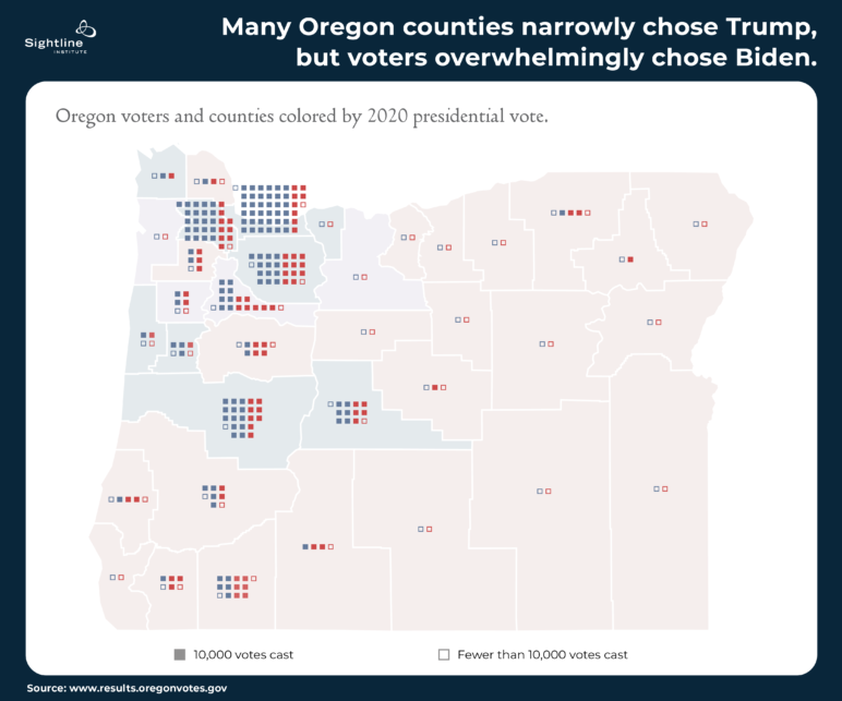
Squares depict voters, with county lines in the background
In addition to hiding people, the maps above hide another important fact: no region is all blue or all red. The boldly colored maps might have you believe that Lane County, Oregon, is completely Democratic or that Spokane County, Washington, is completely Republican. Not so.
The maps below use red and blue squares to represent voters in the 2020 presidential election. This makes it clearer that:
- Most of the people live in a few counties, while other counties have very few people per acre.
- There are both red and blue voters in every county.
- Overall, there are more blue than red voters in both Oregon and Washington.
 Bubbles sized by number of voters
If you don’t like all those squares, here’s a map with small and large bubbles to show the number of voters in each county. This one goes a step further in showing the diversity of Cascadia: not only are counties not all red or all blue, but people didn’t only vote for Biden (blue circles) or Trump (red circles), but also for other candidates. This is a truer, more human-centric view of Cascadia: a lot of people live near the I-5 corridor, and there are folks with differing views no matter where you go. You can in fact meet Trump voters in Portland and Biden voters in Malheur.
 Zooming out further to the national level shows the power of depicting voters on the background of the land instead of pretending the land is the same as the voters. The maps here, for instance, give more accurate views of US voters than the red/blue state maps you see on election night. The geographical map is the background, but voters are front and center. It clearly shows that:
- much of the country east of the Mississippi River is densely populated, whereas the Mountain West comprises large swaths of unoccupied land;
- large numbers of voters clustered in big cities voted for Biden;
- many voters spread out across the North, South, and Appalachia chose Trump; and
- there are conservative voters in cities and progressive voters in less populated areas.
Americans deserve better maps
Visuals are critical tools for helping people quickly grasp complex information. But they should depict that information honestly, not deceive viewers into false understandings.
In the case of maps, they’re great for showing how long it might take to get from one end of the country to the other and even to remind viewers of the vast spread of geographical realities Americans live within from day to day. But when it comes to showing how people vote, maps should show voters and not pretend that acres are people.
Particularly in a time when Americans feel more politically divided than ever, they deserve maps that help to show the more nuanced mix of votes and values that actually exist across their polities. Maps like those above. (And might I suggest you bring a copy to Culp’s next campaign rally?)

Greg
I wonder if better maps would actually make a difference to the rural voters that seem to think that their vote should have more weight than an urban voter. I get the impression from my conservative rural friends that urban voters are somehow less important, which seems mostly to come from the impression (wrongly) that urban voters are the takers and rural voters are the core of this country.
Rich Lentz
“urban voters are the takers and rural voters are the core of this country.”
In 1960 a bushel of corn sold for $2,25 – $2.50 today’s farmers selling price is $7.15. Less than 3 times as much.
1960 VW “Beetle” $1,200 and today’s $26,000 – $40,000 that is 22 to 33 time the price increase of the bushel of corn. WHY/ Ask the Democrats and their Price Controls on anything, everything the farmers grow. Who get the benefits? The people in the Big Cities that don’t even know where their food comes from. What happens to the farmers? They go bankrupt, and then you get to buy your food from overseas and add millions of tons of CO2 to the air.
Pilot4prophet
It’s not that rural voters think urban voters are less important. The cultures are different, the community values are different, the civil process is different. What the rural voters are objecting to is the one size fits all effects driven by population centers dictating the laws to their communities. If you don’t believe in cultural differences, then why are there so many “xx”-American culture associations, in civil and legislative populations? How about you do you, and we do we? Isn’t that freedom? Or is it some social imperative to force the structures of urban problems on rural communities? So using your logical construct, YOUR cultural systems and dictate have more weight than rural culture. Is that right? is that equality? Is that MOB rule? At no point in history, have the people forcing others into compliance been the good guys. You can fact check that one. Rural communities just want to be left alone. Are the rural community members coming into your urban venters and disrupting your social structures? Nope.
Jory Ferrell
The EPA was created to force corporations to stop polluting the environment. The people responsible for the creation of the EPA were absolutely the “good guy” in that scenario, and all the “poor, victimized corporations” were 100% the bad guy.
Jennifer
I live in Washington the big difference in the voting of offical is the fact that not everyone lives in a major metropolis in the state nor do they want to. We as rural area homeowners and farmers have different uses for our lands and homes than those who live in the city. Our lives are in the hands of the farmers and ranchers who feed us everyday. Who supply our grocery stores with food grown and produced in the united states. The city has people with no idea where food comes from deciding all yhis stuff they know nothing about. Good luck eating cyber chips and drinking liquid assests. Hello people get a clue.
Donna Cohen
Good work. Oh, wow, “Someone recently, earnestly, told me that Oregon and Washington legislative lines must be gerrymandered “because Democrats win more elections, but both states are actually red.” When I asked what they meant by that, they said, “Just look at the maps!”
Oy.
Roger Pence
I’ve seen maps where the boundaries are adjusted cartoon-like to reflect population instead of acreage; very dramatic and very effective. Given today’s graphics software, those must be fairly easy to generate, and they would illustrate your point better than the dots and bubbles shown above.
Kristin Eberhard
Yes, cartograms are really cool and visually dramatic and great for many purposes. The one downside is that, especially when the populations differences are really big as they are here, the map becomes unrecognizable. I like these for still clearly representing the Oregon and Washington people are familiar with, and showing the stark differences in actual people.
Justin
It is clear that you have a bias in your thinking, if you are unable to see the problem with the big cities getting to choose all the federal and statewide representatives. The maps are accurate to show that there is a big discrepancy in political values between urban and rural voters. If you were a rural person you would certainly feel that your vote didn’t count. It is straight denialism to not at least consider that big cities are much more vulnerable to election fraud simply due to the incredible volume of people. Consider an electoral college system like a handicap in golf. It actually makes things more even in a sense. It is very easy to not consider this if your side is winning, but keep an open mind. Think of this, say there were 12 tribes of people in an area. One tribe has more people than all other tribes combined. The tribes all trade and share resources but the big tribe definitely needs the other 11 tribes more than they need the big tribe. Now think how those 11 tribes would feel if they all voted on leader, and all 11 tribes voted for a different chief than the big tribe, but lost anywase because of the big tribes numbers. Its not right. You look at the red areas and they include, most of the mines, farms, ranches, logging, oil fields. If the backbone of the nation overwhelming disagrees on values, there is a problem there, and you shouldn’t be so quick to dismiss the people that provide more than thier fair share to society.
Tom
Justin,
You believe that rural voters should have more say than they do in our Representative Democracy.
Here is one of the facts that every conservative I’ve ever talked to (which is most of the people who live around me)
will not acknowledge.
According to the U.S. Census Bureau:
83% of Americans live in Urban Areas
17% of Americans live in Rural Areas
Your very first sentence includes a falsehood. ‘big cities getting to choose all the federal and statewide representatives’ isn’t even close to factual. If you hadn’t noticed there many “conservatives” in all three of our government’s branches.
Your ‘denialism’ is evident in trying to use virtually non-existent ‘voter fraud’ as a proof of your complaint.
You should also do some research on the origin of our Electoral College and why it was created.
There is no such thing as a ‘backbone of the nation’ or for that matter; a “heartland” or a “real America”. These are political propaganda slogans and marketing creations just like the red and blue state maps that mislead us all by showing acreage instead of populations and numbers of votes.
Your self-perceived victimization is clear in ‘the people that provide more than thier fair share to society’. As to that….
Here’s another fact that most conservative won’t acknowledge;
the vast majority of the “red” states RECEIVE more money than they pay into our federal government with their TAXES.
The opposite is true for the “blue” states.
So, if anyone is a so-called “moocher” or “taker” in our nation, it is the conservative “red” states that the “blue” states are having their hard-earned taxes sent to.
Fact: More federal aid (like Welfare and Food Stamps) go to southern white men than any other group of Americans.
Betcha never heard these facts coming from Fox or any other conservative so-called “news” outlets. That’s because they feed you propaganda not facts. They make billions lying to you.
They do this for the same reason MSM “news” spend more air time on celebrity “news” than on the information necessary for citizens to make informed decisions.
Why?
To distract Americans from the fact that Both major political parties are thoroughly corrupted by the legal bribery system that finances our political Campaigns, Primaries and Elections.
To keep their 90%+ re-elections’ Campaign Contributions coming in aka “War Chests” full (so they can keep their well-paying and powerful jobs) our “public servants” MUST cater to the wishes of the corporations and uber-wealthy Major Donors.
We, the People, are mere voters who get to choose from “the lesser of two evils” candidates that these campaign Donors get to pick.
As long as these media outlets (virtually all owned and operated by Corporate Conglomerates) keep the American People divided and fighting each other over “values”, the longer the major donors can continue running our country under our very noses while they hide their money in Tax-Free Off-Shore bank accounts
Until “conservatives and liberals”, and the majority of Americans in between, look up from the battle lines drawn for us by our “betters” and realize that We, the People, are being scammed while the few morph our Democracy into a Plutocracy, they will keep getting richer while we get poorer. Just the way they like it.
We have nobody to blame but ourselves because we have the power to demand the necessary changes. But, instead, we fight each other over “values” aka “Culture Wars”. Shame on Us All.
Semper Fi.
Sal
We are not a democracy we are a constitutional republic. The founders purposely made it so the three or four biggest cities couldn’t decide the election. The electoral college is doing exactly what it was meant to do. Otherwise the only places politicians will campaign is the big cities.
Barbara Surovell
We owe the red state/blue state idea to Gertrude Himmelfarb, wife of Irving Kristol,
and leading conservative of the recent past. It’s an idea that was/is diabolically ingenious because it is
so visually persuasive. And as the article says, acres don’t vote. People vote.
cherlyn olsen
What this mapping represents is the very reason votes should be by counties and not by states. Rural and Urban do not represent each other; the saying “land does not vote, people vote” is a horrible statement because Urban people have no idea of the needs of those in Rural areas and vise-versa.
JT Hidde
I tend to agree. At this point, with the viability of effective government becoming more and more of a pipe dream, perhaps this country should begin exploring how we perhaps dissolve into two…… And still respect one another as close allies with different ideas of governance. Maybe a Traditional American Republic and a Democratic Social States or something on the other side. Like you mentioned, farmers don’t want to be governed by woke theorists… and I doubt urban people would like to be governed by a bible and gun toting rancher. I don’t see the two party animal system of elephants and donkeys getting any more civilized in the near future.
Frankly, at this point, we all need to STOP FEEDING THE ANIMALS!!
James
Splitting up really does feel like the best solution. Having our own laws, our own borders, and so on would make a huge, positive difference in our quality of life and increase political stability massively
Michael
Who decides how to split everyone up? This makes the least amount of sense. Why don’t we instead try to see other people’s point of view, respect people, and quit voting for politicians that are looking for power and sound bites?
Jonah Kyle
The issue is that the vast majority of producers are Republican while the vast majority of takers are Democrat. So the Democrats would NEVER allow a situation to occur where they could not control the producers’ output, which would happen in a split. If that were to occur, within a couple of years the blue states would fall into massive disrepair, while the red states would show a massive economic boom and safety, after which the blue states would have to be absorbed into the red states…but under the red states’ new Constitution, which would have jettisoned most of the onerous regulations and controls that the original blue states held over the entire country in the first place.
In short, if the states agree to divorce and separate, the blue states are gone within a few years totally, and the red states…in this case ALL the states…will STAY red this time around.
Jacob
Pretty much everything you said is 100% counter to reality. Fact: Red states take more welfare money than Blue states. Red states would go bankrupt within the first year without big Blue state money propping them up, or they would let their poor starve to avoid going bankrupt. You don’t seem to understand that Blue states are FULL of government paid, private sub-contractors who do the maintenance and make a good living off of tax payer funded contracts (I was one once). As well as tech workers and artisanal custom industry types. If the Red states pulled out, they would go bankrupt, the farms would go under from being deregulated, global food prices would rise and the Blue states would be able to afford the price hike while corporate buyers extracted all of the food from the consolidated farms and the Red state citizens wouldn’t be able to afford to buy their own food anymore.
Michael Weksel
I think you miss an important point. No one is misunderstanding the message of the maps. You are right that elections are decided by votes/people, but the land mass coloration makes it obvious that many rural voters are disenfranchised by the priorities of the heavily populated coastal areas. The implication there is to move more decisions away from centralized governments into the hands of local governments that can be more responsive to varying needs and priorities of the electorate. An all-powerful federal government is not how the American system was designed and its evolution there has left many underrepresented.
Jay Lee
Michael, you’ve hit on a couple really important points. I totally agree that not every decision should be made by the federal government! While something like the military might be best situated there, something like local parks or sewage maintenance is probably best handled by the county or town.
I also think we should be clear what’s we’re talking about with these maps. These maps don’t show that people are being disenfranchised, that their right to vote is being restricted. That’s an important issue, but not really covered in this article. What you’ve (correctly) identified is that Trump voters were outvoted by Biden voters in both states, but in many rural counties there were more Trump voters than Biden voters.
But even then, it’s not every single resident in rural areas agreeing on priorities that are opposed by every single resident in urban areas. Even in decidedly urban Multnomah County, there were more Trump voters than 15 smaller counties combined that mostly voted for Trump. In fact, more than half of Oregon Trump voters lived in blue counties on the map, that mostly voted for Biden. None of those voters show up on this type of map.
Mikey Pee
We’re a Constitutional Republic, not a Democracy.
Dean
I think how state elections are decided is very different than presidential elections. The founding fathers were very concerned about the republic and decided the electoral system was best. We must remember we are a republic and not a pure democracy.. there is no way 2-3 counties which may be bastions of liberalism (or conservatism – should that ever happen) should decide who will be the leader of the country.
Jacob
Well they wouldn’t if we had a direct vote for president. Without the EC batching votes every vote would matter instead of 5 swing states every election. Competing for every voter in California would matter instead of writing it off as automatically democrat. Competing for every voter in Mississippi would matter instead of writing it off as automatically Republican. And the founding father’s stated main concern in creating the EC was to give more votes to slave owners, so not the great talking point you think it is.
Eric
Yay, let’s face it. The vast majority of people on the blue will paint a picture of togetherness. But, they hate red voters, who mostly, just want to live their lives. They’re busy with work, not long commutes in traffic, staring at a computer or phone screen.
We’re just not a nation anymore. The US map used…it’s accurate. Large urban areas where minorities vote for Democrats, even though, they’ve done nothing to improve their lot in life. Oh well, you get what you voted for…
I’m for entire dissolution. Democrats move to blue districts, red voter move to red district. See ya. Hope it all works out for you.
Jacob
1. Blue districts work, hard. I was a repair man for 15 years doing college part time and now I’m a product designer.
2. The cost of my (paid for out of pocket) health insurance dropped $200 a month thanks to Obamacare. So yes voting for Democrats improved my life.
3. Like the majority of Democrats, I am white (75% of US pop). Although I do live in a majority black county.
4. My majority black county is FULL of entrepreneurs and small business owners of all races, and this may surprise you, minorities aren’t just given money by the federal government, they have to work.
So we will do fine without you, better even, since Red states consume more federal welfare dollars than they produce in taxes.
Gracie
First past the post structure is wholly undemocratic, it just looks like it is. Wolves deciding what’s for dinner and all that. Winner take all mindset would also mean that if the country was perfectly split minus one vote for either side, then that group wins. Meaning just 1 person under half the entire country is not being represented and having to deal with policies that they are against, if not find outright offensive or harmful.
All countries should have proportional representation, because the reality is, most people don’t fit either red or blue. Democrat and Republican are too narrow of a scope to ever cover the concerns of the citizens.
Democracy is representation. Blue and red doesn’t represent anything. Not to mention, a lot of people over the years gave up on voting because the system doesn’t work very well. Let alone all the trickery, deceit and other tactics inherent in politics. Because politics in a system where there is a “winner” isn’t about making change and enacting policies that are for the betterment of a nation, it’s about power and about subjugating people who don’t agree to whatever all ruling party exists at the time.
America is a right wing country. There is no representation for the left and never has been since it’s inception. Best that could happen is for anyone who is actually left wing in policy to leave if they could (which isn’t possible, but I wish it was) Calling Democrats left wing is silly. They’re centrists at best. America’s constitution and policies are mainly right wing oriented (And I’m not conflating conservative vs liberal, because wings are about economic policy, not social ideals). If people truly cared about freedom, expression and representation, America wouldn’t look like how it does, because there are plenty of people who are neither left, right, conservative or liberal who get nothing.
There are left wing conservatives. There are right wing liberals and there are people who associate to none of the four. Those people end up having to vote for a party they don’t associate to at all. They end up getting lumped in with what they feel are lesser of two evils, which Democrats have been utilizing as a party for years. “Sure, we suck, but look at the other guy, you gotta vote for us.” It’s an ineffective party. Republicans also don’t all agree with the GOP, but they associate to other sides of conservatism, or they might only associate to the right wing economically and not socially.
The parties are too narrow. You have right wing liberals and right wing conservatives. If you’re at all left wing, you have nothing. If you’re none of the above, you have nothing. If you like policies of one group, but dislike others and like policies of the opposing group and dislike others, then you also have nothing.
Having two parties is childish. It’s us vs them mentality and encourages a lot of division and fighting. The USA is probably more like 6 parties in reality and would actually be less aggressive to itself because when you have more than just us and them, you start to bridge and find more commonality among your fellows. Humans aren’t black and white in our beliefs and ideals. We’re full of contradictions, double thing and the ability to change what we think. Our politics should reflect that, and it just plain doesn’t.
Pilot4prophet
Note to Author: Kristin Eberhard. We live in a Democratic REPUBLIC, not a Democracy. There’s a difference.
Jacob
So you think that means….. what? That an uneducated, gullible minority should be able to override the educated, critical majority? What is worse than tyranny of the majority? Answer: tyranny of the minority.