
I just extracted myself from this time warp of an interactive map at Forbes. It lets you analyze domestic migration in recent years for every county in the US. Not only can you see population and income summaries for each place, but you can get specific information about the counties that are donating or receiving residents.
Here’s a look at how domestic migration plays out in Curry County, Oregon, population 22,364.
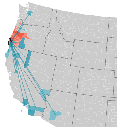
The blue indicates counties that are sending net population to Curry County, while the red shows places that are, on net, taking residents away from the county. (Darker colors indicate larger net migration.) Curry attracted an influx of residents from Seattle, Los Angeles, Las Vegas, Sacramento, and Phoenix. But Curry County lost about 400 people overall from 2005 to 2009, with a net departure of folks into nearby southwest Oregon.
Here’s what Yakima County, Washington looks like.
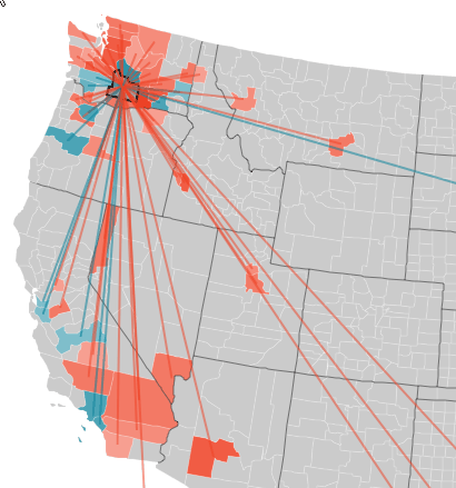

Although Yakima County is dispering residents to a fairly large number of places, it also added about 15,000 people overall from 2005 to 2009. If you mouse over the counties connected to Yakima by migration, you can find fun facts like this: King County traded 564 people to Yakima County for 636 Yakima residents to the big city. Or this: Yakima County sent 32 people to Orange County, California with a per capita income of $17,800, while Orange County sent 57 people to Yakima with a per capita income of just $8,000.
Finally, here’s a look at Ada County, Idaho, home of Boise and a big net gainer of population in recent years.
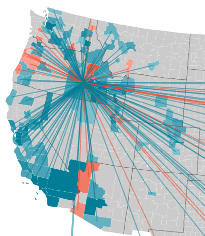

Ada grew by about 45,000 domestic migrants, picking up large numbers of people from southern California, Puget Sound, and much of the rest of Idaho.
I know there’s lots of stuff like this on the web these days, but I found this particular information display to be unusually easy on the eyes. Get over there and play around with it.