Donate Newsletters

I said I wouldn’t post a new one for a while, but apparently I just can’t help myself.  Here’s a chart of VMT per capita in King County, Washington, based on data provided by the state department of transportation.  (Here’s the VMT data, and the population counts.)

Chart: decline in per capita VMT in King County

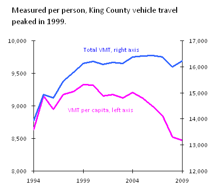
As you can see, total vehicle travel in the county was basically flat from 1999 to 2009.  But the county’s population grew over the same period, meaning that vehicle travel per capita fell by 9 percent.

I’ll say it again:  transportation models say this sort of thing simply doesn’t happen. Yes, we’ve been through a couple of recessions over the last decade. Yet population and the region’s economic output grew, and traffic volumes still remained flat.  And the per capita decline started before gas prices soared, and well before the economy cratered.  So to me, it’s hard to avoid the notion that transportation planners have to abandon their assumptions of endless traffic growth. About a decade ago, something, or more likely some combination of things — demographics, psychographics, fuel prices, frustration with congestion, development patterns, and basic economics — started changing our relationship with our cars.

Talk to the Author

SwatchJunkies

Talk to the Author

Clark Williams-Derry

Clark Williams-Derry focuses on United States and global and energy markets, particularly issues affecting the Western United States.

About Sightline

Sightline Institute is an independent, nonpartisan, nonprofit think tank providing leading original analysis of democracy, forests, energy, and housing policy in the Pacific Northwest, Alaska, British Columbia, and beyond.

3 thoughts on “Where Are My Cars: King County”

  1. AGREE with comment above. Also would like more/clearer explanation re what VTM per capita, purple left axis means as opposed to blue VTM, right axis… Thanks.

  2. Yikes, I should have labeled the right axis better.

    The purple line is just the exact same VMT per capita data that was reported by King County, on a different scale andas a line chart rather than a bar chart.

    The blue line is VMT per capita multiplied by population. But (my bad!) it should be labeled as millions of miles. That is, the right axis should range from 12 billion to 17 billion total vehicle miles traveled per year. That’s a lot, I know, but it’s what happens when you have almost 2 million people driving well over 8,000 miles per capita.

Comments are closed.

For press inquiries and interview requests, please contact Martina Pansze.

Sightline Institute is a 501(c)3 non-profit organization and does not support, endorse, or oppose any candidate or political party.

You can power us forward on sustainable solutions.

See an error? Have a question?

Find the author's contact information on our staff page to reach out to them, or send a message to editor@sightline.org.

Privacy Overview
Sightline Institute

This website uses cookies so that we can provide you with the best user experience possible. Cookie information is stored in your browser and performs functions such as recognizing you when you return to our website and helping our team to understand which sections of the website you find most interesting and useful.

Strictly Necessary Cookies

Strictly Necessary Cookie should be enabled at all times so that we can save your preferences for cookie settings.

If you disable this cookie, we will not be able to save your preferences. This means that every time you visit this website you will need to enable or disable cookies again.

3rd Party Cookies

This website uses Google Analytics to collect anonymous information such as the number of visitors to the site, and the most popular pages.

Keeping this cookie enabled helps us to improve our website.

Additional Cookies

This website uses social media to collect anonymous information such as which platform are our users coming from.

Keeping this cookie enabled helps us better reach our audiences.