A while back I promised some charts based on the BP Statistical Review of World Energy. So, for your geeky viewing pleasure, I’ve created a “motion chart” that tracks global wind power installations, from 1997 through 2010.
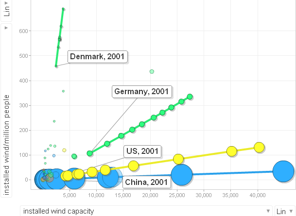
Click here to see the wonktastic “motion chart.” It takes a few moments to load, so be patient. And once it loads, feel free to play with it a bit to get a feel for the numbers. The vertical axis of the chart represents per capita wind power installed in various countries, and the horizontal represents total wind power.
To me, the chart shows three lessons.
First, Denmark was an early leader in wind power. Even today, they have far more wind power per capita than any nation in the world. Of course, the small nation benefits from being part of a larger European grid—so they can still turn on the lights even when the wind has died down. But Denmark was able to parlay an early lead into a major global competitive advantage: nearly half of all wind turbines sold around the world are made by Danish manufacturers. Clearly, being in the forefront of this clean energy technology has allowed Denmark to reap a major competitive advantage.
Second, Germany and Spain stand out for making steady progress. In 1997, the two nations’ performance wasn’t particularly noteworthy. By the middle of the 2000s, Germany led the world in total wind power installations, a position it relinquished only at the end of the decade. Meanwhile, Spain ended the decade in the number 2 spot for per capita wind power.
Third, the US—sometimes called “The Saudi Arabia of Wind“—led the world in total wind power capacity in 2008 and 2009. But in 2010 the US lost its overall lead to China. The US still beats China in terms of wind power per capita. But despite the surge in interest in renewable power in the US, China came on strong in 2008 through 2010, with massive, rapid deployment of wind power that rocketed the Asian giant into a position of global leadership.
A chart like this helps put America’s energy picture in perspective. Wind farms have generated some controversy in the US—and yet its per capita generation falls leagues behind the world leaders. Clearly, the “Saudi Arabia of Wind” has yet to embrace the technology the way other parts of the world have.
[Thanks again to Pam MacRae for formatting the BP spreadsheet so that Google Motion charts could read them.]

I couldn’t believe the number of windmills I spotted in Spain. The whole north is covered in them (solar, too).