

The interface is none too easy to use, but it doesn’t take too long to get a hang of it. Here are some quick instructions, if you want to check it out…
1) Click on the US map to get the full mapping interface
2) Activate the “zoom in” tool—the magnifying glass icon in the upper left hand corner of the screen—and zoom into a place you’re interested in
3) Click “Create/Change Overlay” and select “Create Travel Sheds”
4) Choose the freehand tool (from the popup) and draw an area on the map
5) Click on “Thermals” to see where the people who live in your selected area work
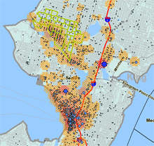
As nifty as the mapping features are, though, I think there’s some reason for caution before you take the numbers as gospel. According to this report (pdf link) there can be some sizeable holes in the data, including missing information on the location on actual workplaces, especially for employers with multiple work sites. That matches up with my experience playing around with it a bit in the Seattle area: it looks like many jobs may be attributed to corporate headquarters (downtown), rather than the actual locations where people work.
That said, it’s fascinating to see where people do (and don’t) travel for work. My overall impression is that there are a fair number of people making pretty wacky commutes—and that promoting a few regional job centers in each metropolis might be a good way of making it easier for transit to handle more of the heavy lifting during rush hour.