The problem with income inequality—apart from the fact that it’s unfair and perhaps shredding the fabric of American democracy—is that it’s devilishly hard to talk about clearly. Any subject matter that relies heavily on a concept like “quintiles” is going to result in a certain number of glazed-over eyes.
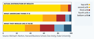
I’ve longed for some clear and compelling visual depictions of income inequality trends—something that could bypass the econo-speak. So I was delighted to discover a recent graphics-rich portrayal of income inequality in Mother Jones. I’m not sure it’s the final word on the subject, but it does include some informative portrayals like this one:
The whole thing is worth checking out.
I still feel like there must be a simpler and clearer way to depict this stuff, but MJ’s efforts are undoubtedly a big step in the right direction.

Another great image illustrating this is the income parade image. An example of it is in Google images at income-parade.jpg. I think Harper’s did a similar image for the US.