We already linked to one of these charts in Weekend Reading, but I think it deserves more attention. A slew of cool infographics and research published lately have highlighted how Americans’ spending has changed over the last 60 years or so.
The upshot: We’re spending more money on bigger houses, health care, and cars. And we’re spending far less on goods that have become industrialized or that can be produced more cheaply elsewhere—particularly food and clothes. In 1900, those two items alone accounted for half of a family’s budget. In 2000, they made up a fifth of that budget.
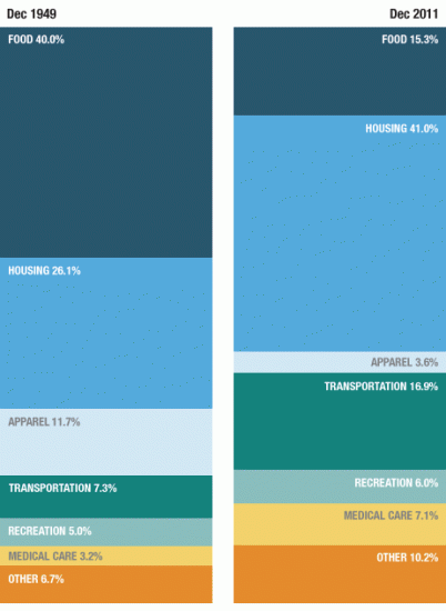
Here’s one of the charts from NPR’s Planet Money:
And here’s another chart from the Atlantic Monthly showing some of the same trends (for a larger image, click here):
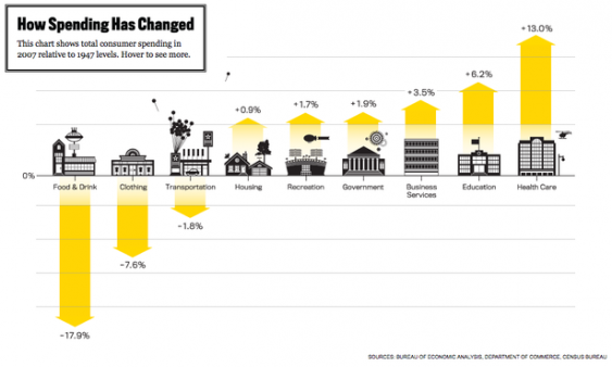
There’s a discrepancy between the two charts on transportation—one showing a big increase and the other a small decrease in spending. They look at slightly different years, but that seems unlikely to account for the difference and neither is explicit about what they included in that category (though this original Bureau of Labor Statistics report on 100 years of US Consumer Spending appears to be a source).
Nonetheless, Planet Money, which found transportation spending on the rise, attributes it to the rise in cars. Their blog points out that in 1950, there were only three vehicles for every 10 Americans. By 2000, that had risen to eight vehicles for every 10 Americans. And they link the rise in housing costs to the fact that people are buying and renting much larger houses. While average home sizes have begun to shrink recently, we’re still living much larger than we used to. In 1950, the average new house was less than 1,000 square feet; in 2000, the average new house was over 2,000 square feet.
This fascinating Atlantic Monthly series does a good job of explaining why some things have gotten more expensive while others are far cheaper:
Spending on items that could be manufactured or produced globally — food/drink and clothing — fell the most…
Across the economy we can see that items that require fewer and fewer American workers per completion (think: socks) get cheaper, while services that can’t find similar ways to replace American workers (think: health care, education, government) don’t get cheaper at all. In fact, they often get more expensive.
The Atlantic’s latest installment focuses on one of the most dramatic transformations embedded in these numbers: how tractors, chemicals, efficiencies of scale, a shift away from local production and the relentless pursuit of productivity in our agricultural sector have made food incredibly cheap.
Thanks to Matt McRae at the City of Eugene for passing this research along.

I think the rise in proportion of income spent on housing needs to be looked at again. Maybe for higher-income people the rising expense of housing is because of bigger houses, but for many lower-income people, low-coast housing isn’t available much any more – beginning with the Reagan administration, budgets for low-cost housing were slashed – so many families have wound up paying 50% or more of their income for rent and/or becoming homeless.
Kate Gessert, Eugene, Oregon
While informative, these images miss out on the fact that incomes have changes drastically over the past 60 years. In 2005 dollars per capita income in 1959 was around $10,000 while in 2012 it was around $32,000. People respond to relative prices, but they also respond to changes in their income. Economists call the change in consumption as your income rises the income elasticity, and it will vary over different goods. For example if you went from earning $40,000 to $120,00 would you spend 3 times as much money on food? How about buying a house where your mortgage is three times the amount of your prior monthly rent? I think it’s just really important to think about the changes in income, and also remember that a home is the primary investment for many Americans.