How much is 48 million tons of coal?
It’s not an academic question. If big coal companies get their way, that’s how much coal will be shipped through Seattle, up to an export terminal north of Bellingham, and then on to Asian markets each year.
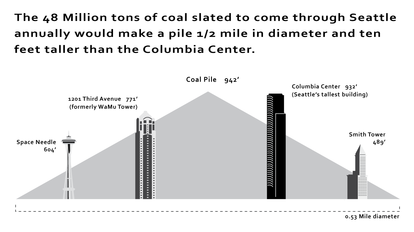
A single ton is easy enough to visualize: it’s 40 cubic feet, or a stack that’s 2 feet on a side and as high as the rim of a basketball hoop. But 48 million tons is tough to visualize without some context, and a little math.
Math? Context? Sounds like a job for…an infographic!!! (Click to embiggen.)
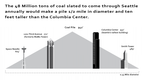
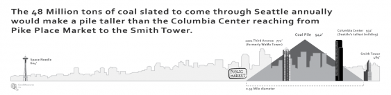
In short, 48 million tons makes a great, big, ginormous pile of coal. A pile nearly 1,000 feet high, and more than half a mile in diameter. A pile that would bury a huge part of downtown Seattle—stretching from Pike Place Market in the north to the Smith Tower in the south. A pile that just happens to be be a bit taller than Seattle’s tallest skyscraper.
It’s a monstrous amount of coal. Each year. And when burned, that much coal releases a tsunami of greenhouse emissions and other pollutants into the atmosphere.
Here’s another version of the infographic, which may help you visualize how that ginormous pile of coal would look against the actual Seattle skyline. (Click to embiggen.)
(Readers: Any comments on which version of the infographic works better?)
Of course, nobody is suggesting that all of that coal would actually be piled up at the Cherry Point terminal at one time. Instead it would be shipped out, one boatload at a time, past the San Juans, across the Pacific, to an import terminal in China (or perhaps Korea or Japan) and then transported to a coal fired power plant. And when burned, we’d get some of the resulting pollution coming right back here, in the form of mercury and soot emissions that can make the trans-oceanic trek on easterly air currents. Not to mention the CO2 emissions that warm the global climate. With coal exports, Seattle gets traffic delays, coal dust, long-distance air pollution, and climate change, with literally no upside.
If that sort of thing makes you miffed, you might want to consider coming out to say something at one of the public hearings. If you plan to attend the Seattle hearing, the time and date have changed—apparently because there’s been so much opposition to the proposal at other hearings that they needed a bigger venue.
Seattle, WA: Thurs. 12/13, 4:00 p.m. to 7:00 p.m. Washington State Convention Center, Ballroom 6F, 800 Convention Place, Seattle
Infographics by goodmeasures.biz. Thanks, Devin!

Great visual!
Think you’ve got time to whip up a similar one for those of us who know the Portland skyline better?
Thanks!
~mike
Thanks, Mike!
I’ll look into it. It does take a while. And the 48 Million tons figure is relevant to Seattle (and in particular, the Seattle hearings on the Cherry Point export terminal), since that’s how much coal will go through downtown Seattle. But some other number might be more appropriate for the Portland metro area. Under current plans, and combining all the export proposals on the table right now, far less than 48 M tons would go through Portland proper, but much more than would pass through the metro area as a whole, combining rail & barge, and both north and south of the Columbia.
Regardless, that coal pile would positively dwarf Portland’s buildings. Wikipedia tells me that the tallest building in downtown Portland is ~400 feet shorter than Seattle’s tallest, the Columbia tower. Tall buildings in Portland are more on the scale of the Smith Tower, the rightmost building in both of those graphics.
Wow! That could even call for a side-by-side graphic of Seattle-Portland coal mountains! A graphic like that could really bring it home emphasizing the coals’ towering monstrosity that’s better off below ground than above. (And with today’s clean energy alternatives, it could really emphasize how passe and obsolete the coal industry is becoming. In other words, why are they wasting their time?!)
I vote for the first graphic, though I like them both. With the second one, I find I’m trying to hold too many images in my head at once, trying to picture the height of the buildings, then Seattle’s geography, and I get distracted.
Also, and this is a bit goofy, but is this pile a big cone shape? It’s not like a pyramid or something, right? I might add a reference to the 3-D shape so people aren’t imagining a flat triangle of coal (and I know you call it a pile but it could be helpful to spell it out a little more).
Yep, it’s a big cone. I suppose at the very tippy top it would be a bit rounded. Thanks for the feedback!
The second graphic works better, the first one makes it seem like the pile will stretch from the space needle, all the way to downtown.
That’s actually my feeling, LF! But from other comments, not just on this thread, I think we’re in the minority.
Visually, I like the instant appeal of the first graphic. But I keep wondering where the Pike Place Market fits in, because you mention the Market in your description.
The second graphic includes the Pike Place Market, but then the Space Needle is so far away it loses its impact.
Maybe you could include a third graphic that just shows the Space Needle — completely buried in the middle of all that coal. The Needle is such a Seattle icon, it could have a huge visual impact!
My Bellingham coal scoping comment (2012OCT27) was about cumulative and comprehensive coal impacts over the useful life of the Cherry Point action, say 25 to 35 years. Billion of total tons of coal, and billions of tons GHG. Can anyone run with this and help us visualize the lifetime impacts of a political pro coal decision today? And then combine all the North West coal actions proposed. Thanks.
For those of you familiar with the Paris skyline (who’s not?), 48 million tons of coal per year corresponds to an Eiffel Tower’s worth passing through Seattle (or Bellingham or Marysville, or …) EVERY OTHER HOUR. Think about it.
Isn’t Portland on the opposite side of the river that the coal trains are on?? Yep it is I work for the railroad on the Oregon side and we don’t run any coal trains, so explain to me how this effects the Portland area again?? I like the little visual thing, to bad he’s blowing it out of proportion, there will never be that kind of coal on the ground, and do you people have a clue how much coal has already gone through Seattle??
We know pretty much exactly how much coal has already gone through Seattle. It adds up to about 1/10th of the amount planned for Cherry Point alone. (See: https://sightline.wpenginepowered.com/2012/10/05/recent-coal-export-trends-q2-2012/)
Coal trains serving Kinder Morgan’s planned facility at Port Westward (30 million tons) and the planned facility at Coos Bay (perhaps 10 million tons) would travel through Portland.
Question: A lot of the pro-coal train folks at the Spokane hearing refuted the idea that 60 additional trains could even fit through Spokane based purely on rail capacity. I’d be curious to know your thoughts on that figure, if it’s an unreasonable request by the coal companies of if maybe the train conductors and engineers I talked to are mistaken.
Thanks,
JP in Montana